The Challenge
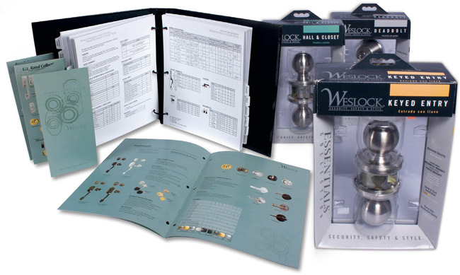
Home renovation and the Do-it-Yourself market has increased dramatically the last few years. Weslock wanted to capitalize on the opportunity with sales to the professional DIYer but their existing packaging line was outdated and stale. Lundmark was challenged to create a new, updated look that positioned their product line as a leader in security, style, and easy installation.
The Insight
The door hardware market is very confusing and congested. There are lots of products with busy packaging with no clear positioning. This leaves the average consumer perplexed and intimidated. The landscape prevented an opportunity for Weslock to steal market share.
The Solution
After analyzing the competitive landscape, Lundmark designed a packaging look that utilized a black and gray color scheme to emphasize upscale style and stood out amongst competitors. The package was also cleaned up and simplified to make it easier to understand for consumers and most importantly, included a different color in the upper right hand corner that distinguished the different product functions.
The Result
The new packaging was well received by retailers allowing Weslock to reclaim shelf space and sell into additional accounts.