

The Situation
Casey’s General Stores, the fourth-largest convenience store retailer in the U.S., recently made a strategic growth decision to focus on private brand snacks and drinks. To compliment a wide mix of product offerings that ranged from packaged bakery items to new snack categories such as chips, jerky and nuts, the retailer launched a new private label line of ice cream
The Solution
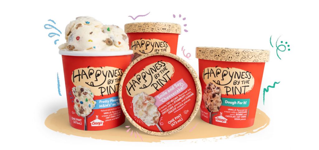
Lundmark set out to design a premium and fun private-label brand that would align with Casey’s mission of delivering a great product at a great price from a brand consumers trust. Brand naming was the first step in developing the new ice cream line. After reviewing consumer insights and analyzing a very competitive ice cream market (and taste-testing plenty of ice cream for inspiration!), we arrived at Happyness by the Pint – because who isn’t happy when enjoying some delicious ice cream?
Next was the package design which was important to reflect the fun and light-hearted tone of the brand. The logo was developed in a script-like font to reflect the humorous attitude of Happyness by the Pint. We chose to utilize Casey’s red brand color to stand out on the shelf and connect to the Casey’s brand. And to increase appetite appeal, we utilized product photography and fun names for each flavor.
The Result
Happyness by the Pint has been a big success for Casey’s General Stores. Not only have consumers connected with the brand, Casey’s is exploring adding additional flavors to the line.