
The Challenge
Coyote Rock, the parent company of four brands in the aggregate materials and trucking industries, needed a logo refresh that would create a professional and cohesive identity. The new branding needed to align with its family of brands while reinforcing its reputation for strength and reliability. With applications across digital platforms, internal systems, and company events, the logo had to make a bold, lasting impression.
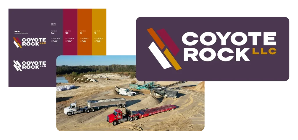
The Solution
Lundmark developed a design that balances tradition with impact. The abstract mark embodies rocks, wheels, and open roads–core elements of Coyote Rock’s industry and brand story. A refined color palette and graphic elements draw inspiration from the materials industry, while bold, structured typography conveys stability and dependability.
The Result
The redesigned identity gives Coyote Rock a professional, cohesive brand mark that reflects its industry, strengthens its connection to its corporate family, and instills confidence in partners and customers. To ensure creative consistency across future applications, Lundmark developed a brand style sheet outlining logos, typography, and color guidelines. Whether on digital platforms, company materials, or event signage, the new logo and accompanying brand guidelines provide a strong foundation for Coyote Rock’s evolving brand presence.