
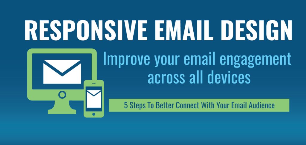
Responsive design.
More than likely you’ve heard this term applied to web design, but have you considered responsive email design as a way to better connect with your audience? You’re probably aware of the increasing use of smart phones to check emails and conduct business. And yet, we struggle daily to view emails on our mobile or tablet device that are formatted for a desktop email client. Images are partially cut off and text is too small, requiring pinch to zoom. This rapid rise in smart phone email adoption has caught many marketers off guard, having not considered the smart phone audience when designing their message.
The process of turning your email into a message that effectively reaches and engages users regardless of device can be challenging as there are no universal standards for email design like those that exist in web design. The bottom line: responsive email design can greatly improve a user’s experience with your email.
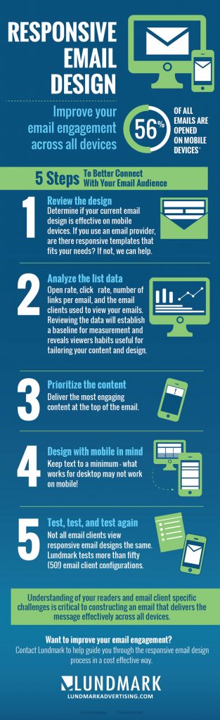
According to the Pew Research Center, the use of smart phones to read emails doubled from 2009-2013. As of July 2016, it is estimated that 56% of all emails are opened on mobile devices. This means that there may be a growing number of readers who are missing your message. In broad terms, you wouldn’t run the same creative in print as you would on your digital channels. The same overarching principle applies to honing in your message to users viewing emails on mobile – content needs to be stripped down, reformatted, and more targeted – in order to maximize its effectiveness. While responsive design does increase overall engagement, generally only the first few links in the email receive higher clicks. This point should not be overlooked when considering content layout.
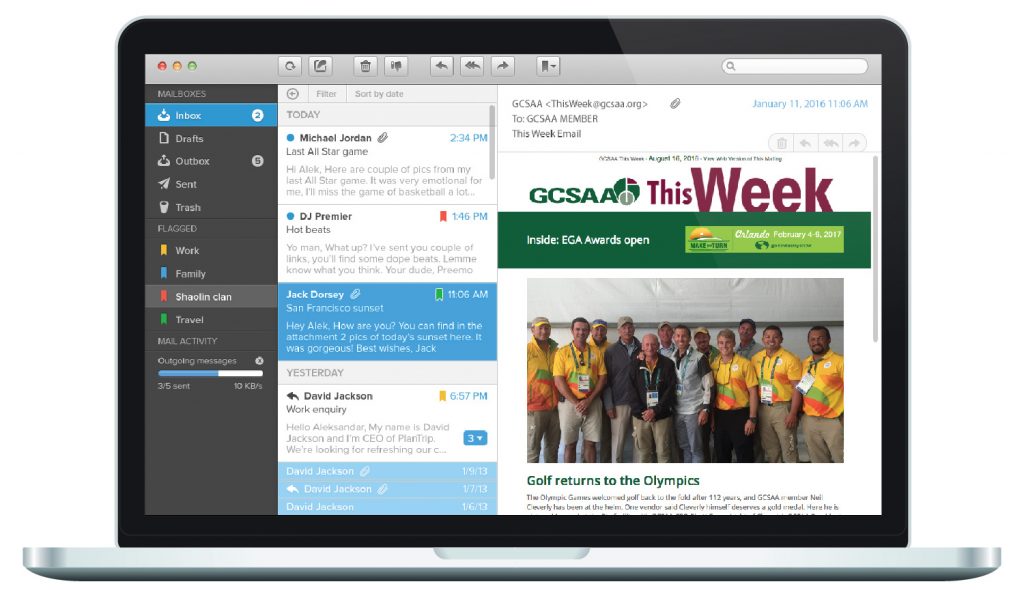
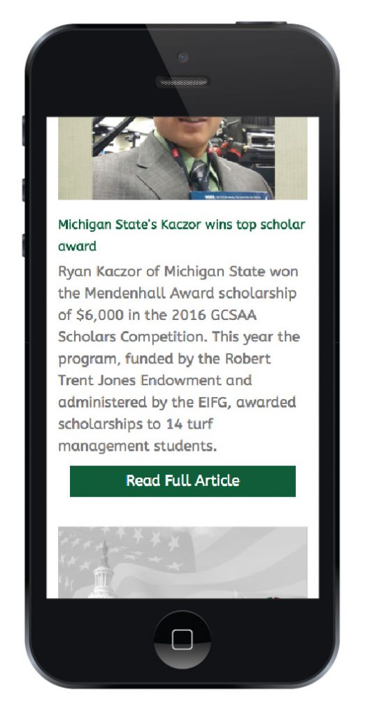
The leading email marketing services, including Constant Contact, Emma, and MailChimp, provide minimal responsive templates for you to consider. Lundmark can help create custom templates based on your needs, as we recently did for one of our clients, the Golf Course Superintendents Association of America.
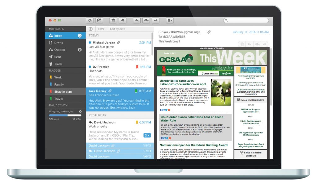
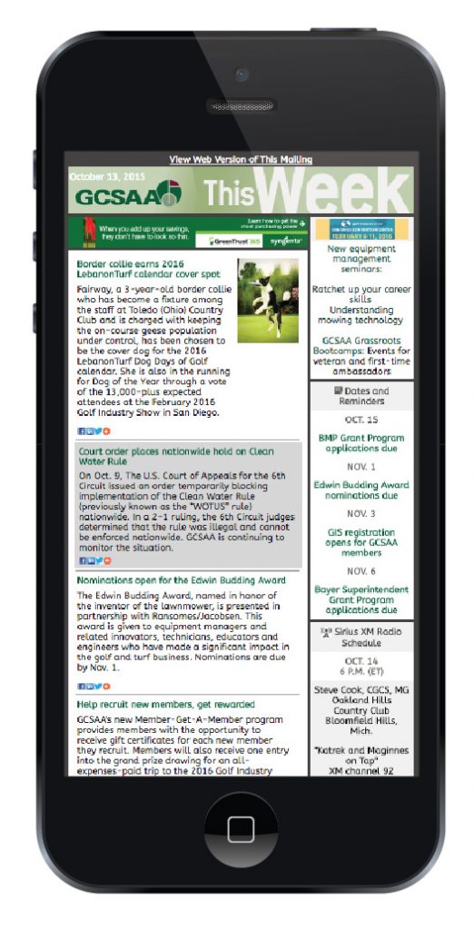
BEFORE – Static email design
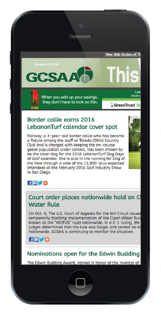
AFTER – Responsive email design

Still feeling overwhelmed? View our 5 step infographic for how to get started.
If you’re looking for a partner that can guide you through the responsive email design process in a cost effective way, give us a call. And be on the look out for our next topic in email marketing – the importance of A/B testing.