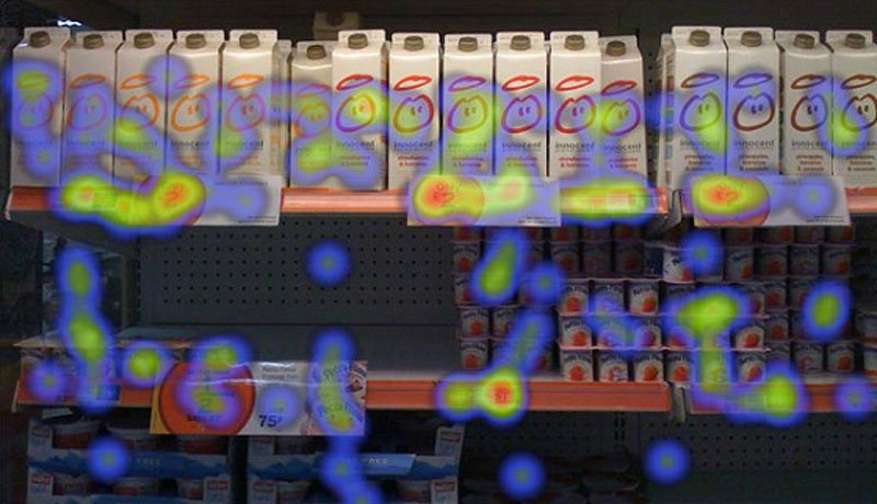
They say that the eyes are the window to the soul. In this case, they are the window to oodles of information about how humans see the world, or at least the advertisements and design elements that we marketers and designers are putting out there.
Earlier this year, Business Insider put together a compilation of some very intriguing Heatmaps that reveal where people are really looking when they are viewing advertisements, packaging labels, and even grocery isles.
As designers (and marketers) of many products that end up on store shelves, think Hostess Brands, Borden Cheese, & Faultless Starch. We are always thinking about the location on the shelf our products will be placed and how that’s going to affect the shopper experience. For example, this heat map of a grocery isle reveals that most shoppers are looking at the top shelf and then working their way down. It’s also noticeable that the top shelves have much much more light hitting the products and the lower shelves are much darker.

As designers and marketers, we are often presented with the challenge of low shelf product placement on store shelves. How we as designers can draw the consumers’ eyes downward is a constant factor when we concept and choose a final design for our client’s products. For instance, when challenged with redesigning the packaging for Ruffies Brand ColorScents trash bags, part of the challenge was competing against some of the top brand names (who get prime product placement) from the bottom shelf. By changing the overall color scheme from a dark blue to white with pops of bright color, we achieved making the product stand out more against the dark black hole that is the bottom shelf of the grocery isle.
This is just one small example of how heat mapping can help guide our industry in making smart and informed decisions about product packaging.
Want to see more heat maps? Check out the original article!