When a brand invests in packaging design, the goal isn’t just to create something that works for one product on one shelf. Today’s consumer packaged goods (CPG) brands need packaging that is flexible enough to work across multiple retail environments, from single servings in convenience stores to bulk cases in club stores. This is where the art of scaling packaging design becomes crucial. At Lundmark, we specialize in taking a single core design and adapting it across a wide range of formats, ensuring consistency, brand integrity, and shelf appeal no matter the retail setting.
One Design, Many Formats
Scaling a packaging design isn’t simply about resizing elements—it’s about understanding the unique requirements of each retail environment and making strategic adjustments. A package that works well on a retail shelf may need an entirely different approach for vending machines, where space is smaller, and engagement is faster. In these cases, vertical orientation can be required, as opposed to the horizontal layout used for single-serve items in stores. Additionally, as e-commerce continues to grow, brands need to consider how their packaging appears in online marketplaces, where product images must convey details clearly at a glance.
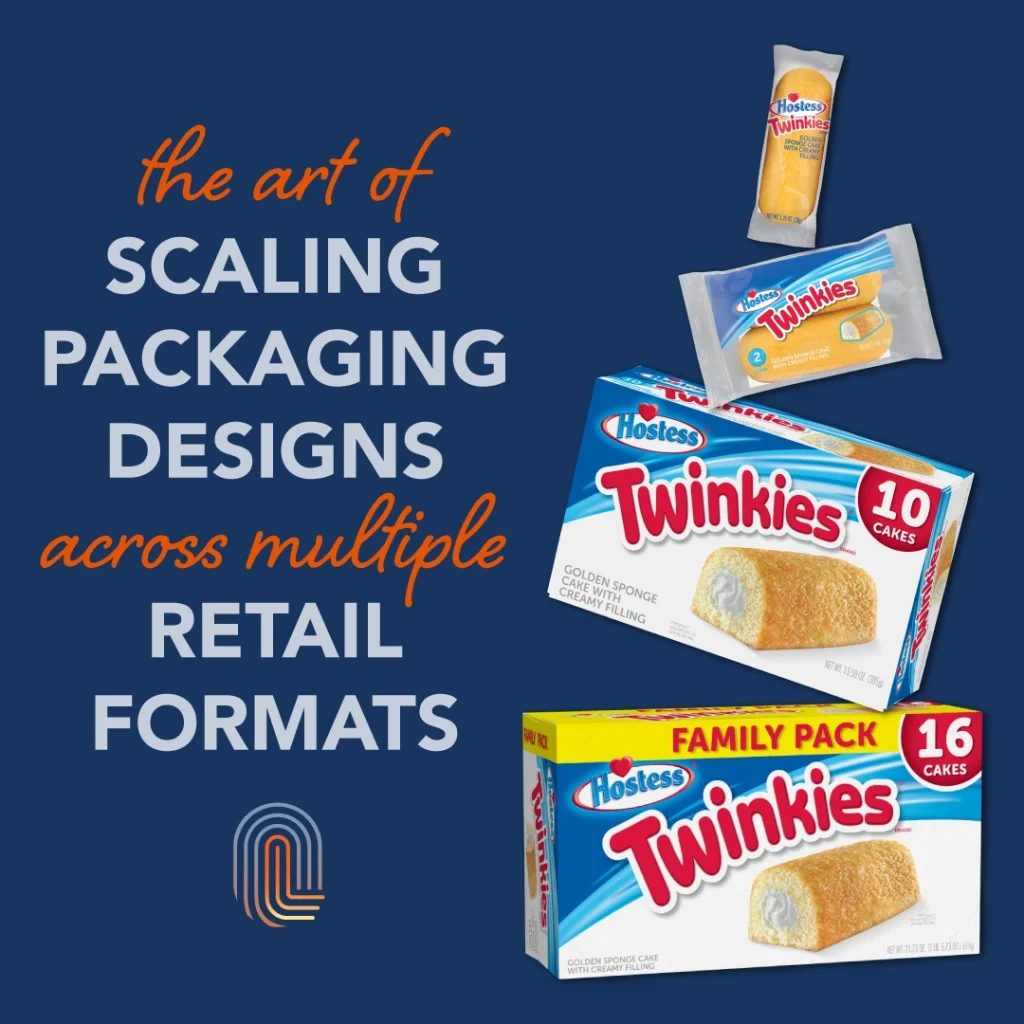
A 10-count retail box for a snack product might need to be reimagined for a 30-count carton sold at warehouse clubs like Costco or Sam’s Club. The brand messaging, visual elements, and product details should remain consistent, but the design must be tailored to the larger format, where there may be more space for messaging, or a need to emphasize value and multi-use benefits. Through careful scaling and thoughtful adaptations, we ensure that packaging remains cohesive and impactful across all formats, from retail shelves to vending machines and e-commerce platforms.
Case Study: Hostess Packaging Adaptations
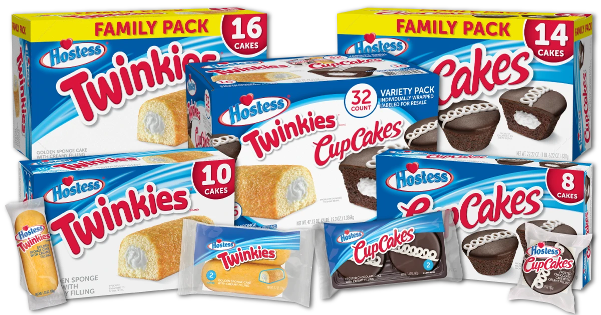
Our work with Hostess illustrates how this approach can be applied successfully. Hostess, a well-known name in snack cakes and baked goods, required packaging updates for multiple products to be sold across different retail environments. Starting with the design of a core product, we adapted the packaging for single-serving items sold in convenience stores, retail packs on grocery shelves, and larger multi-packs for club stores.
In each case, the packaging needed to communicate the same key brand elements while adapting to different consumer touchpoints. For single-serving packages, the design focused on quick recognition and appetite appeal, ensuring that the product would stand out in busy store checkout displays. Meanwhile, for club stores, we emphasized the value proposition, making sure that the larger package conveyed the bulk purchase benefit while maintaining Hostess’ iconic branding.
This project not only required an understanding of different retail environments but also a deep knowledge of production processes. We worked closely with printers to ensure the designs could be executed perfectly across a variety of packaging substrates, from flexible plastic wraps to large cardboard cartons. Each adaptation was fine-tuned to fit the specific product size and packaging type while staying true to Hostess’ brand identity.

Adapting Designs Without Losing Impact
The challenge with scaling packaging designs lies in maintaining the impact of the original design while adapting to different formats and target consumers. Every time a design element is resized or repositioned, there’s the potential for the brand’s message to get lost. At Lundmark, we ensure that no matter the size or format, the core identity of the product remains intact.
Our process starts by fully understanding the brand’s goals and the specific retail environments where the product will be sold. We consider details such as how the packaging will appear on shelves, contemplating factors like shelf lips that might cover the bottom portion of the pack. For club stores, we evaluate how the design will look when displayed in bulk on pallet displays, considering that the packaging could create a postering effect, where repetition of the design enhances visual impact. Additionally, we consider whether the product will be sold in a caddy or display unit, ensuring that the packaging is optimized for visibility and appeal in those configurations.
From there, we use 3D renderings to visualize how the packaging will look in real-world settings, allowing us to make informed decisions about design adjustments. Whether it’s a small single-serve pack or a large bulk carton, the result is a package that feels cohesive, consistent, and effective in any retail environment.
Consistency Across Channels
Consistency is key in CPG branding, and nowhere is this more important than in packaging. Consumers should be able to recognize your product instantly, whether they’re picking it up at a grocery store or grabbing it from a vending machine. At Lundmark, we make sure your brand’s identity remains clear and compelling, regardless of where the product is sold.
Scaling packaging design across formats isn’t just about resizing—it’s about smart adaptation. By partnering with us, you ensure that your brand will look its best in every retail environment, delivering impact and driving sales across channels.
